VISUAL PERCEPTION AND COMMUNICATION
This course helps to practice the use of elements and theories to display visually appealing compositions, which relate to photography, color matching, proper applications of values, and principles to effectively deliver the message of the drawing.The following are some of the artworks that exhibit my learnings from this course.
(Press the labels indicated to view each work.)

REINTERPRET THE STYLE
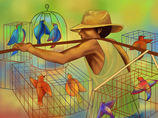
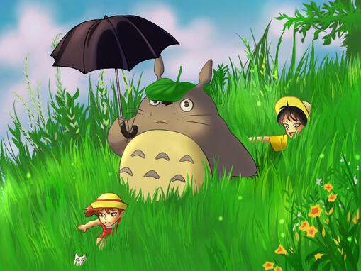
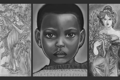
I created my drawings in a semi-realistic style using a digital software with the references provided. At first, I was hesitant about which approach I was going to implement since I have no fixed art style. But by observing the references, I pictured certain techniques that would best suit the way I often execute my drawings when I used to draw a lot of fan arts. The way I rendered the pieces, I tried to make it look simple and lively by adding vibrant colors to the overlay. The style result was still slightly similar to the reference, as I only used a different method for the coloring and somewhat cartoonizing the characters.Link to the references: https://www.canva.com/design/DAFOmjJYzgI/07xtV0e_f6HXpXfvL8iYFA/view
GESTALT COMPOSITION
MULTI-STABILITY
REIFICATION
INVARIANCE
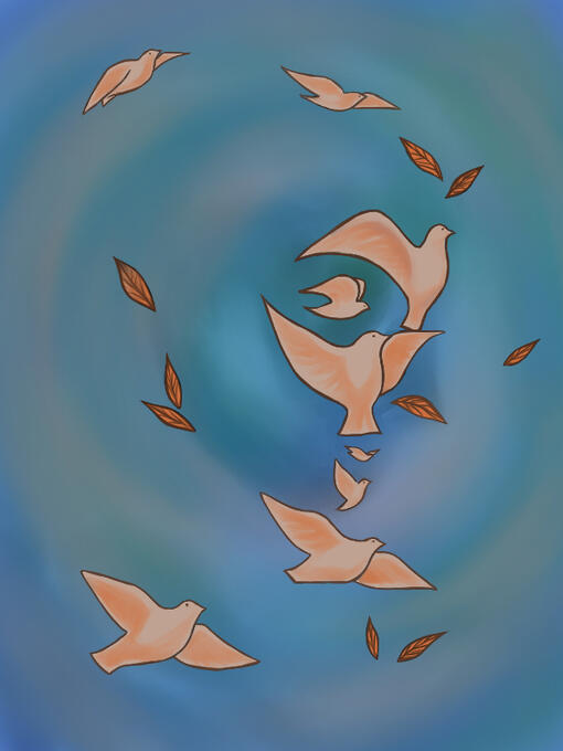
EMERGENCE
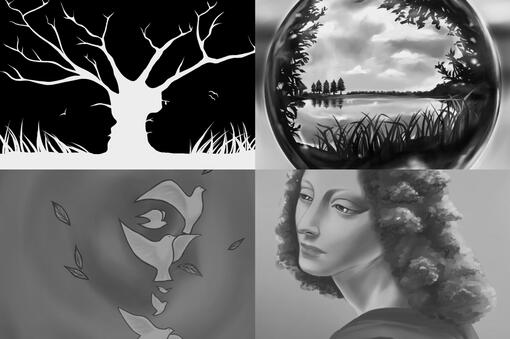
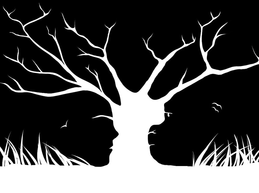
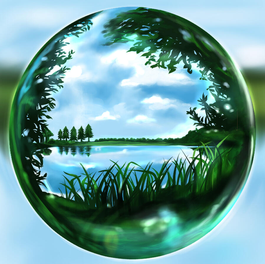
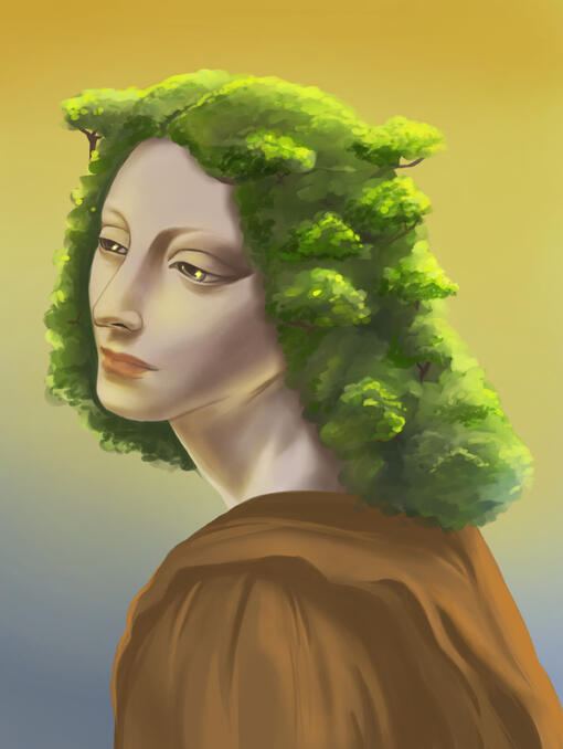
The theme of my work is "Mother Nature." I chose this theme because it can signify and represent almost everything that we could ever perceive, as everything is part of nature.The four artworks exhibit: (1) A woman with her hair as a bunch of trees. (2) A tree trunk with carved side profiles of a monkey and a man into it. (3) Birds and leaves, picturing the face of a woman. (4) A bubble reflecting a forest lake.These concepts interconnect with one another as the embodiment of nature. Through researching, some of the environmental photographs inspired me to execute the concepts by using personification, signifying a woman as nature itself.